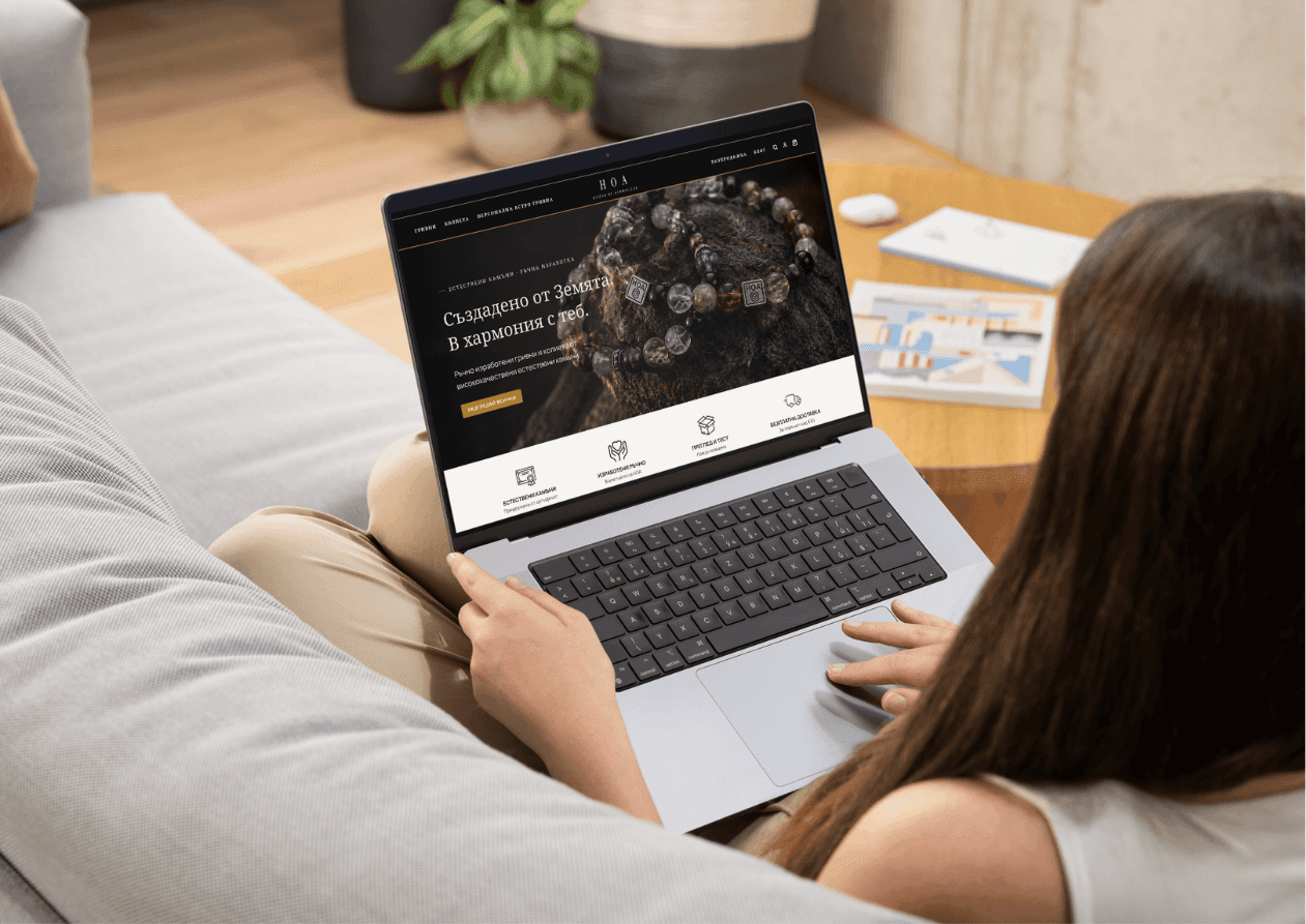
Summary
House of Astrology is a Bulgarian natural-stone jewellery brand whose website was attracting more traffic without converting that interest efficiently into purchases.
I used analytics, review sentiment, buyer behaviour, competitor research and a UX audit to identify confidence, discovery and mobile usability as the main opportunities. I then redesigned the core e-commerce journey mobile-first, including the homepage, PLP, PDP and Personal Astro Bracelet flow, supported by a reusable responsive design system.
The challenge: Support HOA’s move toward a more premium brand while helping visitors see the value, choose confidently and buy.
The outcome: A shipped redesign and reusable direction guide. Three months of impact measurement underway.
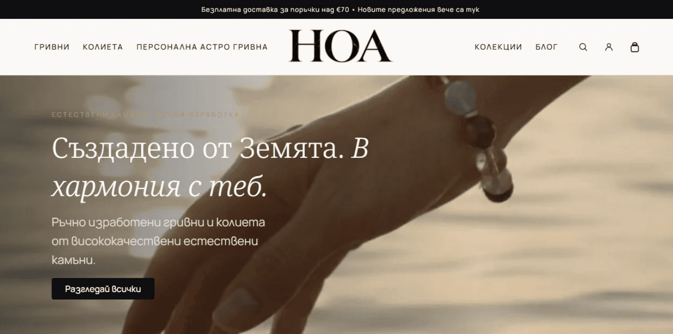
The redesign · Product desire meets practical confidence. Rendered from the supplied theme with sample catalogue content.
My process
From a shared ambition to a clear direction.
I connected the owners’ goals with customer evidence, then turned the agreed priorities into a shopping experience and a practical handoff.
Understand the owners’ ambition. I interviewed HOA’s owners about their goals, ideas and aspirations. We established their ambition to move toward a more premium brand, while retaining the natural stones and personal meaning at the heart of the offer. They wanted black and gold to remain the primary brand colours. This shaped the brief: refine the existing identity and communicate greater value through the design, storytelling and shopping experience.
Read the signals and form hypotheses. I reviewed the existing metrics, customer-review themes and questions to identify patterns in discovery, purchase confidence and progression through the funnel.
Research competing approaches. I compared VIP Atelie, Birthdate Co., World of Derja and Astrid & Miyu to understand how they approached product discovery, personalisation, visual presentation and reassurance.
Audit the existing experience. I audited HOA’s website across mobile and desktop, examining hierarchy, navigation, product information and purchase friction. I connected interface observations to the questions raised by the research.
Plan the next steps. I brought the findings together into proposed improvement paths, prioritising product clarity, trust and an easier route to purchase. I outlined the trade-offs and signals we could use to evaluate progress.
Align with the owners. In our second discussion, I explained the metrics, research and audit, then walked through the proposed next steps. Their business context helped us challenge assumptions and align on priorities before design.
Set the basis for the plan. I captured the direction in a working Markdown brief: brand tone, visual principles, UX guardrails, scope, constraints and technical limitations. It became a reference in my design and implementation stack.
Design the experience. I translated the plan into mobile-first shopping journeys, product discovery, reassurance, Quick Add and guided personalisation. I also worked on the copy, developing a more premium tone through restrained language, attention to materials and craft, and clear explanations of the offer. The visual system and writing carried the same brand direction.
Hand over a direction that lasts. I supplied a separate Markdown guide for the owners covering photography, content, tokens, reusable sections, UX principles and measurement, so future pages and updates could preserve the store’s quality.
Alignment was part of the design work. Analytics could show where to investigate, but not why people hesitated. The second owner discussion added business context, challenged assumptions and made the trade-offs clear before we committed to screens.
The opportunity
Help more interest become intent.
HOA sells bracelets made from natural stones, including designs for zodiac signs and bracelets personalised to the customer’s natal chart. In the owner interviews, we established a shared direction: move toward a more premium brand while preserving that personal meaning.
The redesign needed to express that ambition and make it easier to act on interest. The clearest opportunity in the funnel was helping visitors reach the point of adding a product to the cart.
HOA analytics · Three-month averages · Pre-redesign baseline.
Desire was there. Confidence needed support.
Reviews praised beauty, craftsmanship, gifting and personal meaning. Customer questions and the UX audit pointed to uncertainty about price, materials, sizing, delivery and returns.
“Hello, could I have the price of the bracelet?”
Translated customer question documented in the research: “Здравейте, може ли цена на гривната.”
I led with the jewellery and its quality, then introduced personal meaning and the deeper brand philosophy. New visitors needed a tangible reason to care before understanding the astrology.
The priority: Make the product desirable and understandable, resolve purchase uncertainty, then reduce the effort of acting on interest.
Customer review themes and competitor research informed hypotheses. They were not a representative usability study.
The strategy
Mobile first. Every journey considered.
HOA’s own mobile traffic determined where I started. External retail research supported that direction, while the audit kept desktop firmly in scope.
86.1% HOA visits on mobile
78.7% jewellery sessions on mobile · Syte, 2022
Supporting context, not an equivalent benchmark. In Syte’s 2022 retailer dataset, mobile also accounted for 67.6% of jewellery transactions. This is historical category evidence, not a current Bulgarian market average. Read the findings, p. 11 ↗
A signal is not an explanation. Mobile-heavy usage could reflect preference, ad placement or a desktop experience people struggled to use. I treated desktop friction as a hypothesis to investigate, rather than inferring the cause from device share.
What the existing experience revealed
The audit looked at the hierarchy of the first impression, the effort of scanning the catalogue and the clarity of the personalised purchase journey.

Before / Homepage. A tall header, text over imagery and repeated messaging compete for the first impression.

Before / Catalogue. Dense card copy and interruptions between rows increase the effort of comparing products.
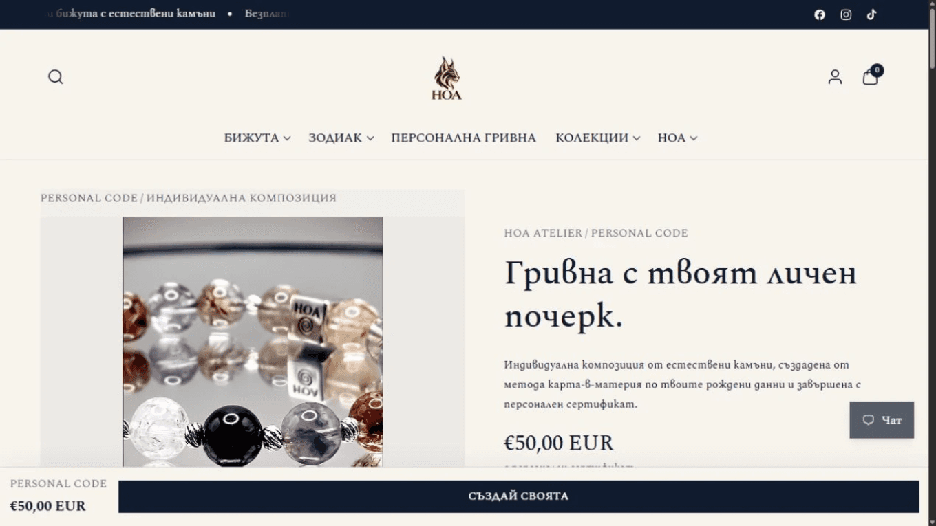
Before / Personalised product page. Strong imagery and a prominent action were already present. The opportunity was to organise configuration and reassurance into a clearer sequence.
The strategic choice: Attract with the product. Orient with clear shopping routes. Reassure with practical information. Enable action without breaking the browsing flow.

Research summary and redesign plan · The working documents behind the strategy. Open either across the screen to read it in full.
The design
Four decisions. One coherent journey.
The redesign addresses four moments where interest could weaken: discovering the offer, trusting it, acting on it and making it personal.
Design decision 01: Make the product the invitation.
Acquisition was primarily ad-led. The research also recorded 71% social traffic, with Facebook contributing 59.7%. I treated curiosity-led browsing as a working hypothesis and used generous product imagery as a route into the catalogue.
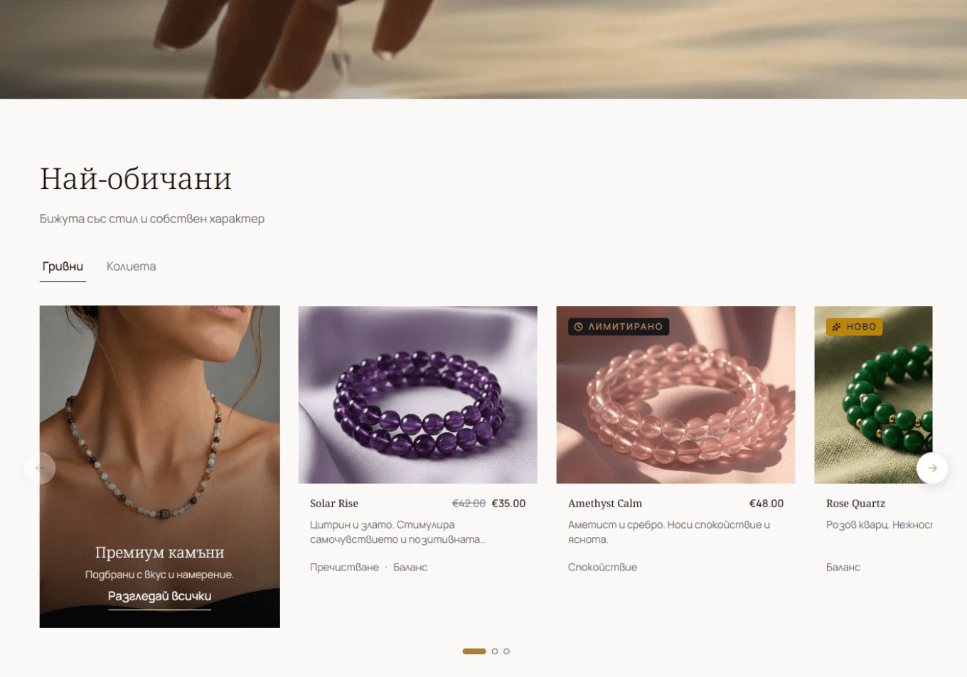
Discovery. Photography earns attention; repeated names, prices and category tabs help visitors compare and choose.
Shopping routes through product type, collections, zodiac and gifting give different motivations a way in. Jewellery leads the story; deeper meaning is available when the visitor wants it.
The trade-off: Richer imagery can increase page weight. Responsive assets and restrained motion support the visual direction. The test is whether visitors find relevant products and progress to cart, not simply spend more time browsing.
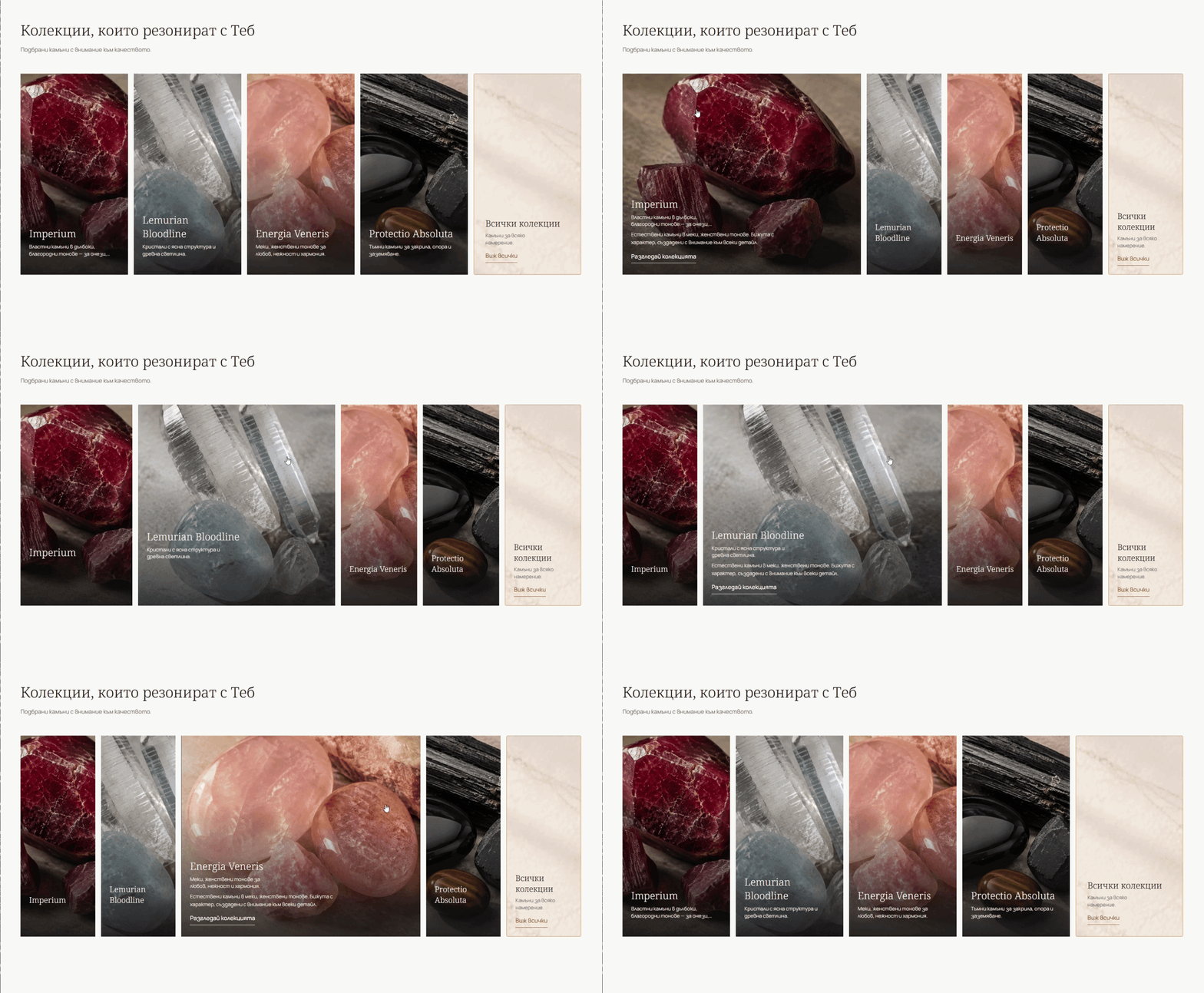
Collections that invite exploration. Expanding cards reveal context while keeping surrounding choices in view.

Personal meaning, made tangible. Choosing a sign updates the featured jewellery and creates another route into the catalogue.
Design decision 02: Let trust frame the experience.
Delivery reassurance appears at the top, followed by an early trust section. Reviews near the end reinforce confidence after exploration. Materials, sizing and policy information support decisions throughout the journey.
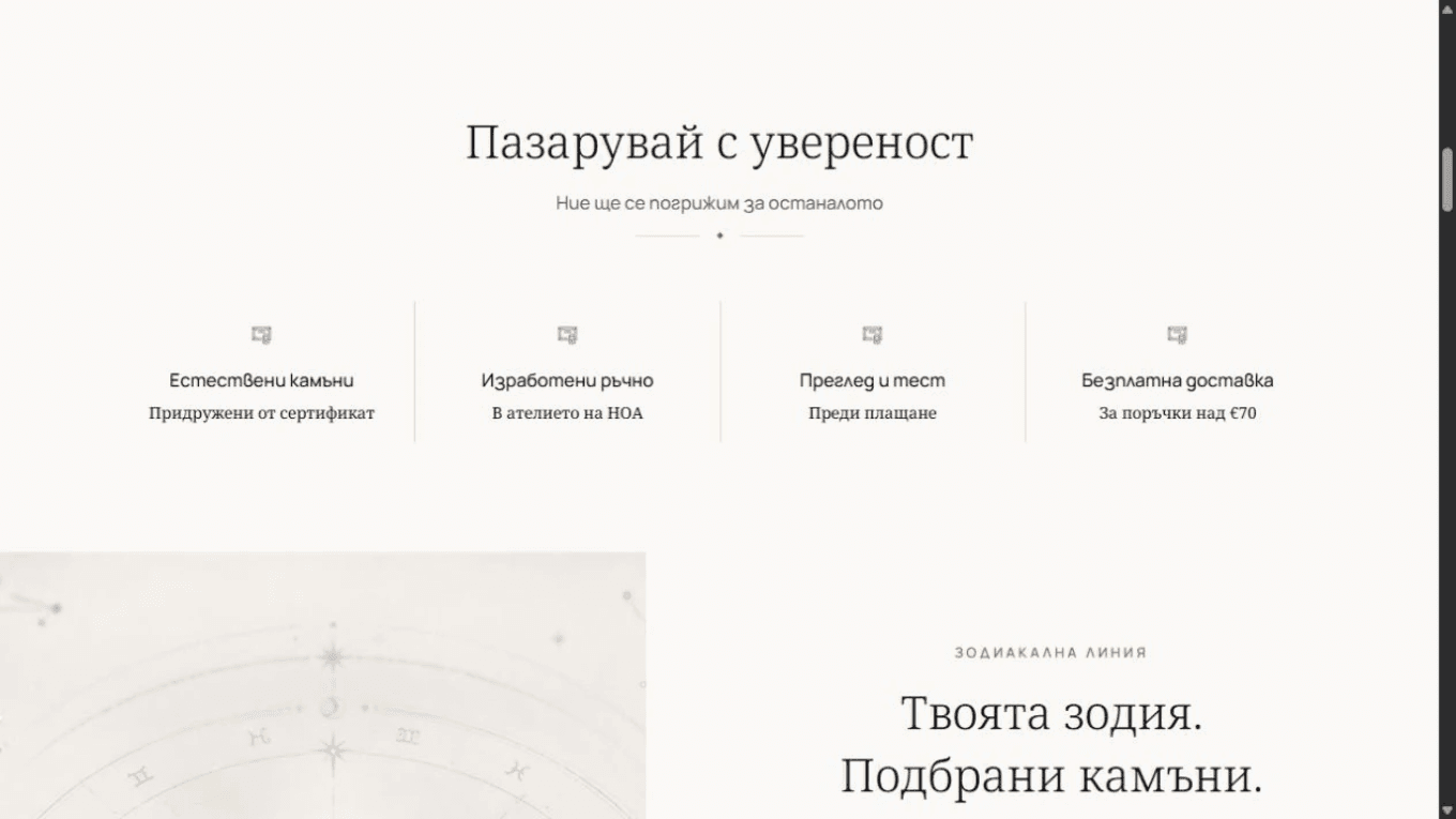
Reassurance early. Concrete promises make quality and purchase conditions easier to assess.

Social proof after exploration. The review carousel connects stories to products. Demo review content illustrates the interface.
Primacy–recency research informed the sequencing: first and last items can be more memorable. It is a rationale for placement, not evidence of a conversion uplift. Visitors who never reach the bottom still need reassurance beside purchase actions.
Cortis Mack et al., 2019 · Serial-position effects in recall ↗
Design decision 03: Buy without losing the browsing thread.
Quick Add brings the product and required choices into the catalogue context. Visitors can inspect details, select a size and add gift packaging without a full page change, then continue exploring.
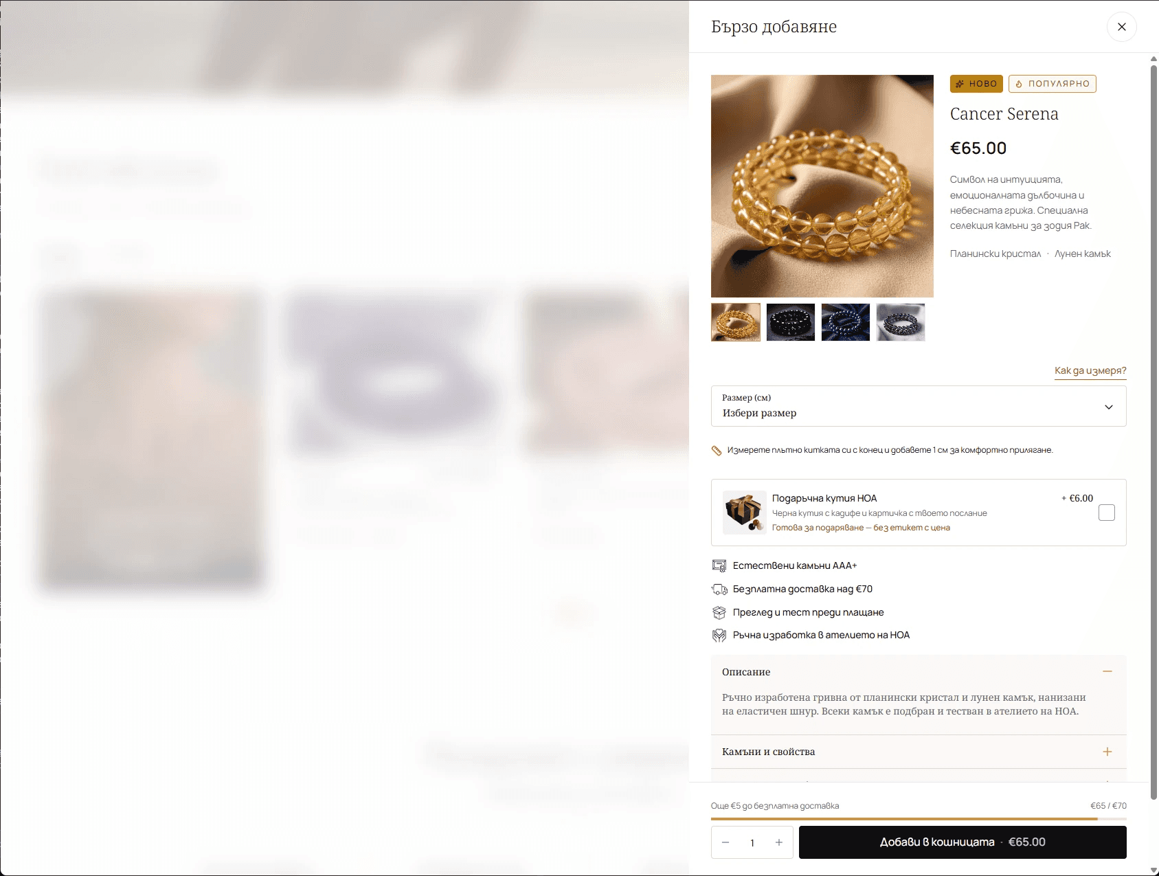
Quick Add on desktop. The catalogue remains visible behind the purchase decision.
Keeping the context does not mean removing the choices that matter. Sizing, expandable details and a route to the full product information support a considered purchase. On mobile, the purchase action stays within reach at the bottom.
Expected impact: More visits reaching the cart, with fewer unnecessary page transitions and less loss of momentum.

Quick Add on mobile. Sizing, gifting, expandable details and a persistent purchase action in one browsing context.
Design decision 04: Make personalisation feel manageable.
Personalisation differentiates HOA, but asks for more confidence than selecting a standard bracelet. I made the journey easier to understand, from the first shopping route to product discovery and guided configuration.

Arrive. A clear first impression and route to shop. Explore. Product imagery and information in a compact hierarchy. Personalise. A guided next step with a clearer sequence.
Practical questions come first: what am I getting, how does it fit and what happens next? The richer stone and astrology story remains available for shoppers who want to go deeper.
Expected impact: More completed configurations and fewer abandoned journeys caused by uncertainty.
The flow
From first visit to cart. Every state accounted for.
I mapped the path a shopper takes on a phone, from landing on the home page to a cart ready for checkout, with every place it can stall and every place it confirms. The screens show what the shopper sees; the diagram shows how each answer leads to the next step.
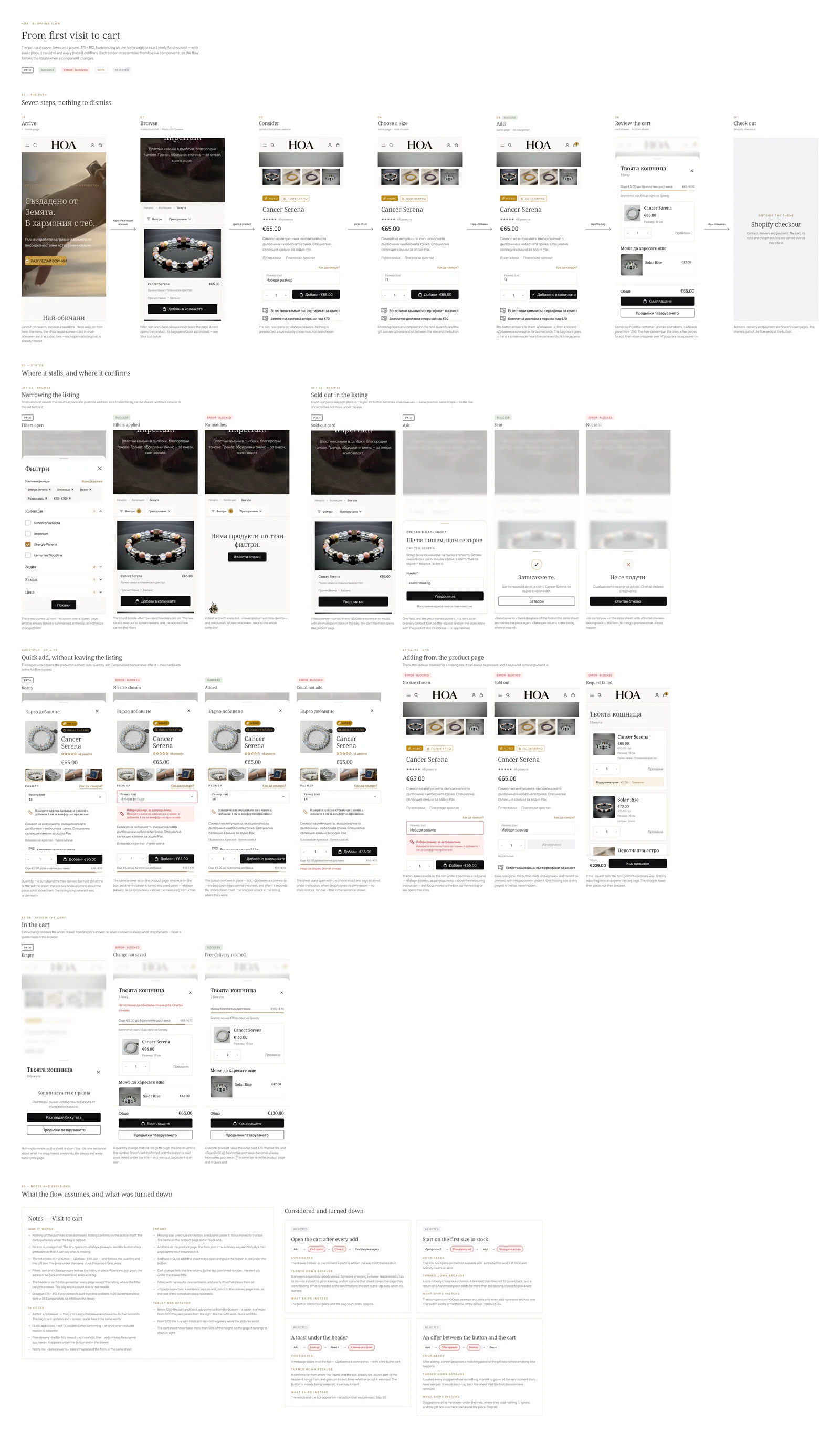
Shopping flow · Mobile, 375 wide. Open it across the screen and zoom in to read the detail.
Visual & verbal craft
Editorial expression. Familiar interactions.
Warm neutrals, deep ink, controlled gold accents and generous spacing give the jewellery room. Considered copy supports the premium direction, while repeated patterns make the store easier to learn.
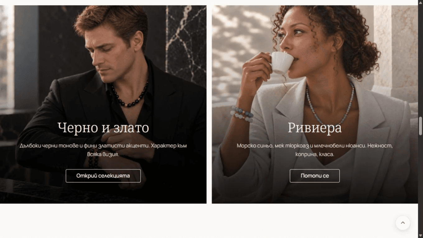
Visual direction. Styled photography creates desire and gives visitors another way into the catalogue.
Keep the black and gold. Give them more restraint.
The owners wanted black and gold to remain central to HOA’s identity. My task was to make that familiar palette feel quieter and more considered. I moderated its visual weight: near-black anchors typography and key actions, gold becomes a selective accent, and warm neutrals give the photography room.
This preserved the brand’s recognisable colours while supporting the premium direction we had agreed on. The shift came from proportion, spacing and restraint, with the jewellery carrying more of the visual expression.
A hierarchy with a job to do. Images establish interest. Names and prices support comparison. Visible actions make the next step clear.
Typography that balances character and clarity. Noto Serif gives the store an editorial voice; Manrope keeps supporting text and controls readable.
A system that extends beyond the homepage. Shared colour, spacing, cards and controls carry across discovery, product and cart. Reusable Shopify sections support future additions.
A premium voice, grounded in the product.
I worked on the copy as part of the move toward a more premium brand. The aim was a calm, considered voice: short expressive headlines, language that draws attention to materials and craftsmanship, and clear explanations where shoppers need to make a decision.
Examples from the Bulgarian redesign copy, translated into English for this case study.
“Created by the Earth. In harmony with you.”
Homepage / First impression
The headline connects the natural origin of the stones with personal meaning. It gives the opening an emotional tone while the supporting copy explains the jewellery itself.
“Chosen with taste and intention.”
Collection / Curation
A concise line beneath “Premium stones” communicates considered selection and complements the photography without competing with it.
“We read your natal chart, select the appropriate stones and craft a one-of-a-kind piece just for you.”
Personalisation / Explain the value
The copy makes the service tangible: interpretation, selection and handcrafting. It explains what goes into the personalised piece and why it is individual.
Expressive language establishes the tone; practical copy keeps the offer understandable. Both support the same goal: helping visitors recognise the value and choose with confidence.
The handoff
A direction the owners can keep using.
The deliverable was a redesigned experience and a reusable Markdown guide. The guide carries the reasoning into future photography, content, pages and sections.
Brand and visual direction. Positioning, tone of voice, image roles, photography, crops and editorial composition.
A reusable design foundation. Semantic tokens, typography, spacing, components, interaction states and page patterns.
UX and implementation guardrails. Purchase reassurance, accessibility, performance, Shopify content fields and technical constraints.
A basis for future product decisions. Customer needs, hypotheses, success measures, constraints and responsibility for changes.
For each addition, the owners can ask: which customer need does this serve, which patterns should it reuse and how will we know it helped?
Expected impact
Shipped. Now measuring what changed.
We’re collecting metrics over the next three months. These are the expected outcomes and the signals we’ll use to evaluate them; measured improvements are still to come.
Higher visit-to-purchase conversion
A clearer path from discovery to a confident purchase.
Measure: Compare purchase conversion with the 1.73% three-month baseline.
More visits reaching the cart
Clearer product value and Quick Add reduce friction before commitment.
Measure: Track visit-to-cart against 4.69%, Quick Add completion and downstream purchases.
Stronger trust and purchase confidence
Earlier reassurance and clearer materials, sizing and delivery information.
Measure: Review customer confidence feedback and the themes and frequency of pre-purchase support questions.
Better product discovery
Image-led entry points and consistent cards help visitors find relevant jewellery.
Measure: Follow product engagement by landing page and source, then progression from discovery to cart.
More completed personalisation
A guided path reduces the effort of configuring a meaningful product.
Measure: Measure starts, step completion and purchases; watch sizing-related support and returns.
Measure the full journey. Separate mobile and desktop, keep event definitions consistent and account for acquisition and product mix. Track checkout progression, page speed, order value and returns alongside conversion. A before-and-after change alone cannot isolate design’s contribution.
Visual craft earns attention. Product clarity and trust help that attention become a decision.
The principle I carried through
Evidence & references
HOA research — three-month baseline, review themes, customer questions and competitor analysis.
HOA UX audit — original experience observations and design opportunities.
Syte, The State of eCommerce Discovery in 2022 — jewellery browsing and transaction shares by device, p. 11; historical category context from Syte’s retailer dataset.
Cortis Mack et al. (2019), RECAPP-XPR — experimental evidence for primacy and recency in recall, not website conversion.
Google Analytics channel definitions — acquisition source and purchase intent are different concepts.
Image provenance: “Before” screenshots were captured from HOA’s existing live website. Redesign media combines local renderings of the supplied theme with screenshots and recordings supplied by the designer. Catalogue and review content shown in demos illustrates the interface; product names, prices, ratings and testimonials in these captures are not treated as verified research evidence.
Reading the evidence: HOA percentages are presented as three-month averages. Review themes and the audit informed design hypotheses; post-launch measurement is ongoing.

